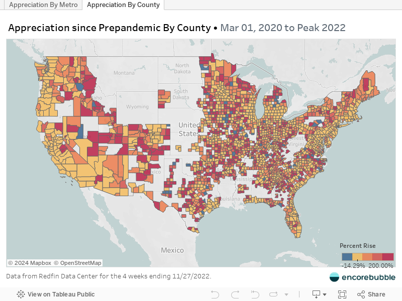
Ever wondered how much your metro has appreciated since right before the pandemic? We all know housing has soared, but exactly how much? And where has it soared the most?
That’s what this map shows. I use the 03/2020 median sale price compared to the peak in 2022 and figure out how much housing appreciated in that metro.
If you mouseover a metro, you can see the data used to calculate the percentage.
All underlying data is thanks to Redfin Data Center.