The tracking and data we have access today kind of blows my mind. And it reinforces my belief that the market will change more quickly this time, than it did in 2005, because it’s possible in real-time to watch the dynamics change in your area, like watching closing prices on Zillow.
However, price change is a very lagging indicator because they are only truly finalized at closing, which is often 1.5 months after listing. So there’s value in early, or “leading”, indicators just because they give us an inkling of what’s to come.
Early Indicator of Demand
One leading indicator is how many showings people are scheduling. In the past, one might consider the traffic at the open house as an indicator but today we actually have aggregate data from a company called ShowingTime.
The same amount of showings have been scheduled this week as were scheduled in the first week of January.
Interestingly, they set up the page to help people watch the impact of Covid, and the page still says “Impact of COVID-19”! But it has turned into the earliest indicator of cooling demand, because it’s updated daily. DAILY!
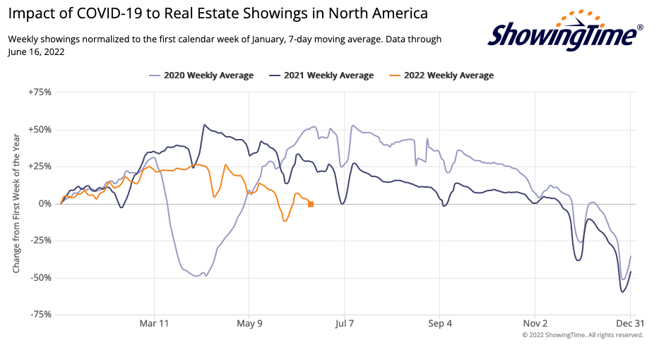
Each line is a year and each year is nomalized to the traffic in the first week of the year. The values are 7 day averages, although it is updated daily.
The orange line above shows that in 2022 we have hit 0% right now in mid-June. The same amount of showings have been scheduled this week as were scheduled in the first week of Jan.
Ignoring the holiday weekend dips, you can see we normally hit this low period somewhere around mid to late November, right before the holiday season. Demand has basically evaporated due to rates. And the Fed just raised rates again this week.
California data
The above graph is national values, and I found out you can get state data by filling in the form with your data. I got access immediately, so it doesn’t seem like it needs any approval.
So here’s the graph for California:
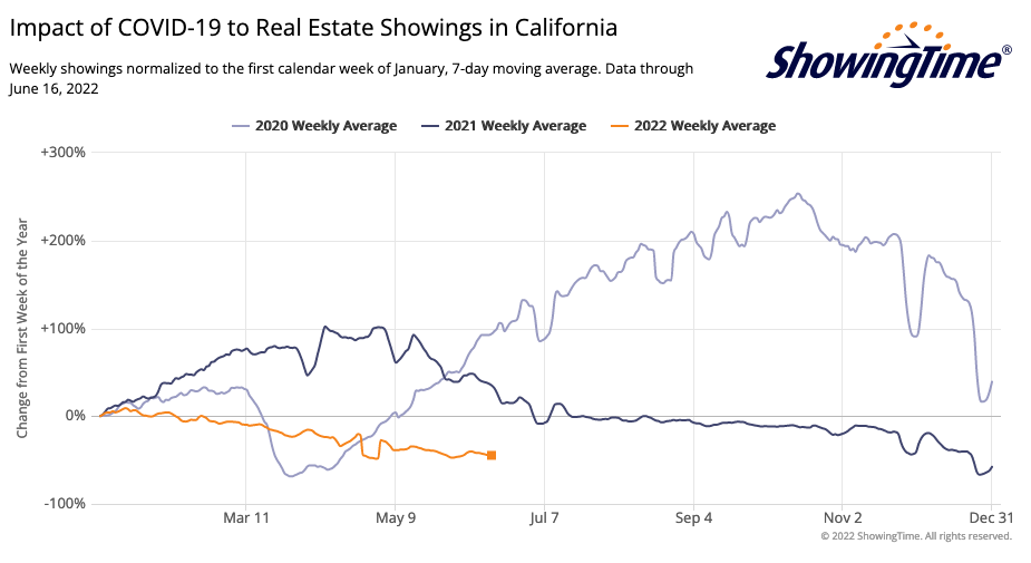
It’s… actually quite different! This is why it’s worthwhile to look at your local data vs. just the national data you’ll see posted in all the articles.
California’s data shows that we had a massive surge in all of 2020, after the pandemic. In fact, we never dropped as low as the first week of Jan that whole year. This perhaps reflects the wave of people seeking more space from California’s densest cities as we grappled with Covid. People were desperate to find houses and kept going through the holidays.
2021 however saw a boost in the first half of the year but then leveled out, with a small dip around the holidays. 2022 on the other hand has been declining since the first week of Jan. Note that you don’t see a significant drop in the last 2 months though, which means demand hasn’t “dropped off a cliff” like we’ve heard anecdotally in other markets. Although it’s been weaker all year so far, than the previous 2 years.
Anyway, I hope this shows how data can vary for your state or market compared to the national values, and why it’s important to seek out data for yourself.
Disclaimer: I’m an idiot first time home buyer. I’ve never taken an econ class in my life. I’m just sharing what I see and learn as it happens. I am 100% certain I will get things wrong, so don’t take any of this as the golden truth.