Sorry folks, this is quite a bit late, being written in mid-October. But work has taken a lot of my time lately. August’s uptick in sales resulted in a median price uptick this month. That’s not great but it was due to the low rates, now that rates are up, pending sales are dropping again and we shouldn’t see another uptick in October.
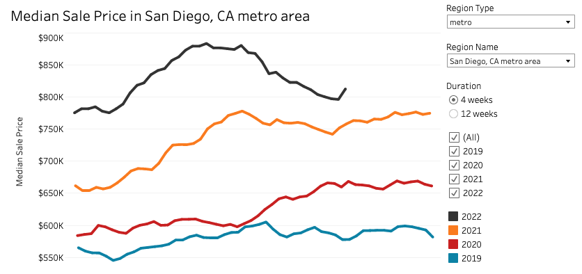
San Diego SFH median price seesaws back up $15000.
All Altos Research data is from the San Diego-Carlsbad-San Marcos metro area.
Redfin data is from the San Diego metro on Redfin data center.
Some updates possible if I see updates from these sources.
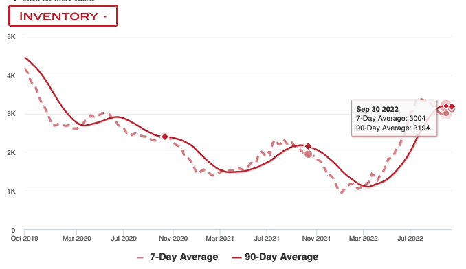
Inventory
Inventory has been dropping in September, which is largely due to very few new listings. Both sellers and buyers have been “on strike”. Since I’m a little late to write this, I should mention that we’ve since seen increases in October but September was a downtrend.
You can investigate more about this using the Inventory Dashboard.
Home Prices
Home prices for the month ticked up, which is not great. This is likely because August had a brief period of lower rates, which led to offers that would have closed in September. This can always happen if we get lower rates again, but so far rates have largely held high in September.
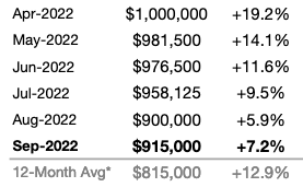
According to SDAR, median price is up $15,000 from August to September. (In their August report they listed 910k as August’s value but seem to have revised that down to $900k).
Redfin’s data echoes this uptick. The absolute value is different, because it’s different source data and aggregates condos and SFHs but the pattern is similar.
This shows us that drops in rates absolutely can have a reheating effect on the market. With that in mind, I am keeping my down payment ready should I need to jump back in again quickly. The Fed has reiterated that they won’t drop rates but you never know.
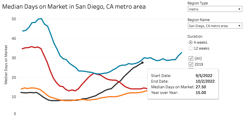
Median Days on Market
Days on market is the number of days the home is listed but before it goes pending. It only counts the homes that actually do go pending. Houses that just sit don’t show up in this stat. It’s a way to tell how fast homes are moving.
Normal for San Diego is 25-35 days. During the last two years, it dropped to 8 days! Currently moving up fast and is at a pretty decent 27.5 days.
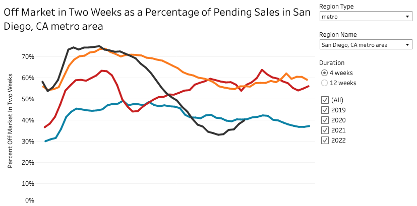
Percent off-market in two weeks is another way to assess market hotness and while that cooled fast in August, it heated back up in September. However, it’s the same as 2019 so still in normal territory.
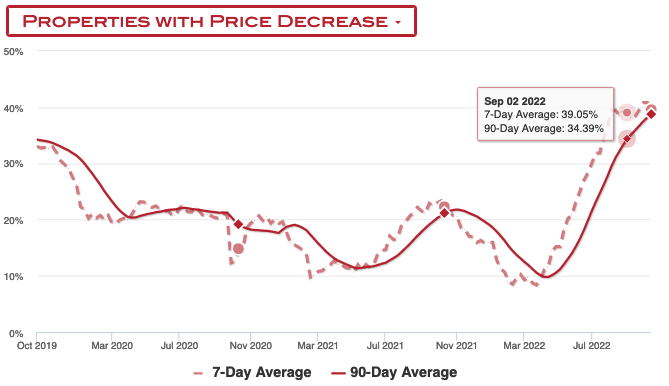
Price Drops
Price drops are holding steady between 38-40% – this is also good news. Today’s price drops are tomorrow median price declines.
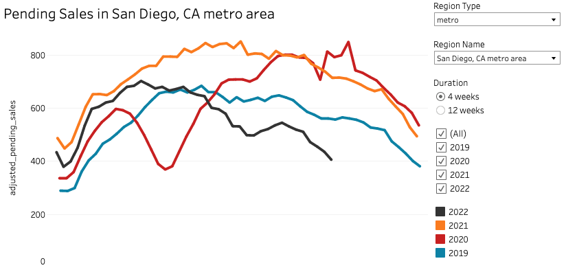
Pending Sales
Pending sales are also a proxy for demand and is less lagging than actual sales. We need this to stay low for the correction to continue.
You can see here the uptick that happened when mortgage rates dropped. But since then the numbers have retraced their journey back down, hitting levels only seen in the depths of the holiday season.
Final Words
So in September, we had bit of a flattening of stats, inventory drop again, prices up, sales down. There’s a bit of seesawing here as the market tries to adjust to the rapidly changing realities. As long as rates stay high and pending sales stay low, I’m not alarmed by this.
Patience is the name of the game right now.
Disclaimer: I’m an idiot first time home buyer. I’ve never taken an econ class in my life. I’m just sharing what I see and learn as it happens. I am 100% certain I will get things wrong, so don’t take any of this as the golden truth.
Goldman-Sachs: We now think certain overpriced markets (like Boise and San Diego) may experience 20% + price corrections.
I suspect they all know but they slow walk it so that they can reposition themselves first.
I have been reading your blog recently and I find it fantastic; a very down and dirty personal view in the trenches of one of the craziest housing markets. I am in a rural boondock in Georgia, USA and barely have any crazy signs or any real effects in the immediate boom from housing bubbles, like in 2008, and same in 2021/2022, only after, of course and this time too probably.
One comment I have is that just to get a broad macro look at what is happening have you taken a look at a chart such as FRED’s “S&P/Case-Shiller U.S. National Home Price Index” graphed over “Median Household Income in the United States”? I am doing *400 just to adjust the price index with income there. It gives a great view just to see how much of a bubble there actually is. I comment because I have not seen a representation like that here so just curious. Michael J. Burry, M.D. said the only difference between the income and home prices there is leverage.
With the lag of home prices and the speed and magnitude of interest rate increases being substantially faster now vs. 2008, I fear this could be worse than 2008, if not solely for the fact that even if there is equal leverage but are in the hands of more credit-worthy borrowers, a smaller object moving at but 10x the speed of a slower one penetrates much deeper.
Otherwise, great blog. For how fast this is all happening I really am surprised there are not more paying attention yet. The powers that be at the Fed must know this though, and if it does play out like it already looks to be, this will be some huge sustained deflation that will solve inflation to me. What a huge cost though.
Hi Thanks for your comment.
Yes! Comparing the HPI against the national income shows how out of whack we’ve gotten. Another really eye-opening chart is this one – median home sales price against the Fed’s balance sheet. Look at that correlation, it’s almost like the Fed poured the money right into the housing market!
https://fred.stlouisfed.org/graph/?graph_id=1030193&rn=456
Which, in a sense, they did by buying MBS. With the conversation around rates, a lot of people forget that the Fed is also doing QT and reducing its balance sheet. I believe that will have an effect as well.
Great chart there. It really is eerie how much these policies truly distort the system. I guess this is just what you would call a classic unintended consequence. You are right on, even if the Fed holds rates high, all this off the balance sheet is like they are continuing to raise interest rates, even though most people are saying it is now peak hawkishness
That chart also nicely shows the leads & lags of monetary policy it looks like. After that initial bump up in December of 2010, house prices didn’t really catch up to that point and fill all that space between the lines until about August 2012. I don’t see that year/ year and a half now though with home prices already starting to fall in 2022 though and the Fed having just begun shrinking the balance sheet, maybe only a month long gap or so? I guess all that potential energy having built up bursts out faster than you can build it up.